Render Props
renderTopRightUI
(isMobile: boolean, appState:AppState) => JSX | nullA function returning JSX to render custom UI in the top right corner of the app.
renderCustomStats
A function that can be used to render custom stats (returns JSX) in the nerd stats dialog.
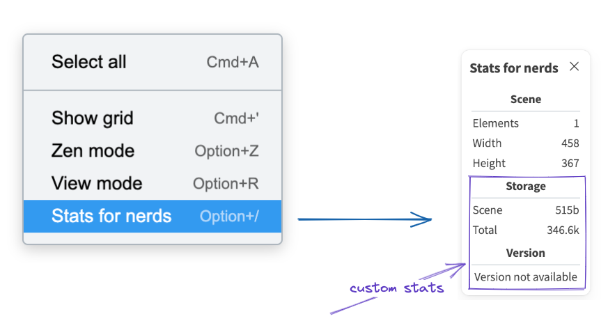
For example you can use this prop to render the size of the elements in the storage as do in excalidraw.com.
renderSidebar
() => JSX | null;
You can render custom sidebar using this prop. This sidebar is the same that the library menu sidebar is using, and can be used for any purposes your app needs.
You need to import the Sidebar component from excalidraw package and pass your content as its children. The function renderSidebar should return the Sidebar instance.
Sidebar
The <Sidebar> component takes these props (all are optional except children):
| Prop | Type | Description |
|---|---|---|
children | React.ReactNode | Content you want to render inside the sidebar. |
onClose | function | Invoked when the component is closed (by user, or the editor). No need to act on this event, as the editor manages the sidebar open state on its own. |
onDock | function | Invoked when the user toggles the dock button. The callback recieves a boolean parameter isDocked which indicates whether the sidebar is docked |
docked | boolean | Indicates whether the sidebar isdocked. By default, the sidebar is undocked. If passed, the docking becomes controlled, and you are responsible for updating the docked state by listening on onDock callback. To decide the breakpoint for docking you can use UIOptions.dockedSidebarBreakpoint for more info on docking. |
dockable | boolean | Indicates whether to show the dock button so that user can dock the sidebar. If false, you can still dock programmatically by passing docked as true. |
The sidebar will always include a header with close / dock buttons (when applicable).
You can also add custom content to the header, by rendering <Sidebar.Header> as a child of the <Sidebar> component. Note that the custom header will still include the default buttons.
Sidebar.Header
| name | type | description |
|---|---|---|
| children | React.ReactNode | Content you want to render inside the sidebar header as a sibling of close / dock buttons. |
To control the visibility of the sidebar you can use toggleMenu("customSidebar") api available via ref.